onsdag 29 oktober 2014

DH2320: Lab 1 - WebGL and Three.js


This lab was an introduction to WebGL and Javascript 3D-Library Three.js. My experience of using the two is that it was much easier getting in to Three.js. The sample code given was straight forward and not as dense as the WebGL. Also Three.js has a lot of built-in methods which are extremely easy to use. 

For example: new THREE.CubeGeometry( 2, 2, 2 );  will generate the geometry for a cube with size 2.


Make the first cube look as the second one:

This was pretty straight forward as instructions were exact. In short i needed to change some different parameters. However, it was good to see hoe the two scenes worked and how they differ. 

Adding a tetraherdon:

This was a harder task since it requiered me to "think" in 3D which I was not used to.
In WebGl you have to manually define the vertices of an object. I drew a XYZ-system on paper to try to see where the points should be placed. A tetrahedron has 4 faces, all of which are spanned within 3 vertices, and there is a total of 4 vertices in the tetrahedron.
However I was unsure about edge length and so on. I used information from wikipedia[Link]
where it says that:


The following Cartesian coordinates define the four vertices of a tetrahedron with edge length 2, centered at the origin:
(±1, 0, −1/√2)
(0, ±1, 1/√2)

To understand how the vertices should be connected I tried to think of each vertices as defines by which faces it spanned:

verticesTetra = [
        // Red Face
        1, 0,  -1/Math.sqrt(2), //Red - Yellow - Pink
         -1, 0,  -1/Math.sqrt(2), //Red- Yellow -Green
         0,  1,  1/Math.sqrt(2), // Red Green Pink
        //Yellow face
        1, 0,  -1/Math.sqrt(2), //Red - Yellow - Pink
        -1, 0,  -1/Math.sqrt(2), //Red- Yellow -Green
         0,  -1,  1/Math.sqrt(2), //Yellow-Green-Pink
        // Green face
         0,  -1,  1/Math.sqrt(2), //Yellow-Green-Pink
        -1, 0,  -1/Math.sqrt(2), //Red- Yellow -Green
          0,  1,  1/Math.sqrt(2), // Red Green Pink
        // Pink face
        1, 0,  -1/Math.sqrt(2), //Red - Yellow - Pink
         0,  1,  1/Math.sqrt(2), // Red Green Pink
          0,  -1,  1/Math.sqrt(2), //Yellow-Green-Pink
    ];

So there are 4 vertices and they are all connecting to three of the vertices.

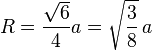
For Three.js there is a method THREE.TetrahedronGeometry() which helps with creating the geometry of the object, very helpful. However, I had some problem figuring out how to make sure that the size of the tetrahedron was the same as the in the WebGL scene. The THREE.TetrahedronGeometry() method takes one argument, radius of a circumsphere which fits the tetradhedron. Again, according to wikipedia the radius is given by:
R={\sqrt{6}\over4}a=\sqrt{3\over8}\,a\,  where a = edge length. 
Since edge length of the tetrahedron i used for WebGL was 2, I used a=2.


tisdag 28 oktober 2014

DH2320: Lab 2 - Photoshop Techniques


This lab was about Image Restoration, Retouching, Designing and Creating Textures in Photoshop. I will go through all the steps of the assignment together with my comments


Restoration:

❏ Read the excerpts from Photoshop Restoration & Retouching.


Comment:OK


"Work on baby.png (Figure 3). Correct the faded colors by adding an adjustment layer. Save the result. Make sure to work on the assignment image called baby.png that is shown when you click on the image! This must be done for all other images as well."

Comment: The image in the lab assignment is not called baby.png which was confusing(same goes for all the other pictures). I added two adjustment layers with blending mode Multiply on top of each other. The first one with opacity 100%, the second one with 50%. I then cropped the images a little bit to remove the edges which still looked a bit faded.


❏ "Work on scratched.png (Figure 4 below). Fix the following issues by using the Clone Stamp(and copy-paste if needed)"


The image is damaged on the right hand side.


There are a large number of scratches and dirty areas. (You only have to remove the most prominent of these.)


Don’t forget to work in new layers so you don’t destroy the original background layer!"


Figure 4. Scratched.png

Comment: I corrected the scratches and the damage using the clone tool. I was pretty straight forward. I noted that you have to be careful with lines and shadows in the image and do your best to try to make those continuous in the updated picture.


"Work on pink_flowers.png (Figure 5). Use Image -> Adjust -> Replace Color… to change the pink flowers to a different color! Try to achieve a natural-looking result."

Figure 5. Pink flowers.png


Comment: I used the Replace Color tool to sample several pinks in the flowers and then replaced all of them with red. I think the image was a poor choice since it is so pixelated. It is hard to tell how successful the result was.


"Work on marsvin.png (Figure 6). Correct the color shift and the balance between shadows and highlights. You will notice that some information is missing in the darkest and lightest areas, so you will probably not achieve a perfect result. But give it your best try. Also, the composition isn’t entirely successful – it is unclear what the subject is. Try to improve it!"


Figure 6. Marsvin.png

Comment: The Auto-Tone and Auto-Contrast adjustments helped me out here to correct color and get more contrast in to the the image. I then fined-tuned with the Shadow/Highlights tool to get as much information out of the photo as possible. Finally i created a duplicate layer, which i blured. I then used the erase-tool to cut the boy and the guinea pig out, them showing from the background layer. This gives a focus in the photo.


Retouching:

"Work with phat.png (figure 7). Reduce the weight of the model! Here is a suggested workflow: Copy the background layer to a new layer. Select the area that you want to modify with Elliptical Marquee. Choose Filter -> Liquify… and use a large brush with low pressure to “push” and “pull” the shape. Use Reconstruct tool (in the Liquify dialog) to improve places where the distortion becomes too large."


"Improve the composition of the image."


Figure 7. Phat.png


Comment: To make the model thinner I followed instruction using the Filter -> Liquify.To improve composition I played around with the Shadow/Highlight tool to make the sky more interesting.

Creating seamless textiles:

❏ "Work with wood.png (figure 8). Create a 512x512 wooden tile from the texture! Any kind of manipulation is allowed! There are a number of problems in the image that you may have to correct before you begin creating the actual tile: There is a camera distortion, there is a coffee stain, the lighting is not uniform across the image, and there’s a shadow in the bottom right corner."

Figure 8. Wood.png


Comment: This was by far the part of the lab I spent most time on. There were no real instructions on how to make a tile. So i had to google most of it.

Creating a Square:
I started with using Filter->Lens Corrections to try to fix the slight lens bending(fish eye?) of the picture. Then I used the Clamp Tool to try to remove the coffee stains and the shadow in the right corner. Next I used the Crop Tool to cut out as big of a square as possible from the image. I used the left side of the picture since there seemed to be more balance in lightning. This in the end made most of my previous corrections mostly unnecessary since I cut out big parts of the image anyway. I resize the cut out square to 512 x 512 pixels and continued my work with that as background.


Balancing Light:
To balance the light, I duplicated the background layer to a new layer which I inverted and then used a blur filter on and put opacity to 50%. This helped a bit with balancing the light so i merged the layers. Next i played around with the Shadow/Highlight tool to try to further balance the light. I also made the wood a bit darker and with more contrast. My tile now looked like this:


I was quite happy with this so i moved on(then ran in to trouble on the next task)

Webpage

"Using the code from the your finished DH2320 Lab 1 create a webpage that only contains the Three.js part."


"Use the wooden tile image created previously as a texture for the rotating cube. The tetrahedron should have the same coloring as before"


Comment: I followed the instructions to add the texture to the cube which was pretty straight forward. And I think the results looked pretty okey. But the instructions also said that the texture should be repeated at least two time on each direction(one face = 4 tiles). When adding this, you could clearly see a pattern of tiles on the cube. I thought that maybe i had not done enough on my tile texture so I went back to edit it. I found a number of guides on the internet which all recommended using Filter -> Other -> Offset to make the tile more seamleass. I created a duplicate layer of the tile, then used Offset to move the pixels a certain amount horizontally and vertically. This, as i understand it, is used to destroy patterns in the image. I then used a mask on the layer and erased out parts to smoothen the edges the offset hade created.


My new tile looked like this:


When adding this to the cube it looked slightly better and you could not notice the pattern of the tiles as much. I still feel that covering the whole face with one tile looked better but kept the 2x2-repeat since that was given in the assignment.


Result:

LINK


Montage and Design:

❏ Create a graphic design for a poster for a real or imagined public event of your choice, e.g., a concert, a lecture, a party, etc.

Comment: I made a poster about an interactive bag that we created in a interaction design course.
The purpouse of the poster was to describe the features and the interaction of th bag. For the Logo/Name i took a photo of the fabric that we used on the bag and imported it to photoshop where i cut out the letters. The other pictures were imported and contrast and color balance was edited. Here is a low res version of the poster